How to make an inset rounded cutout card in CSS
Picture a card with rounded corners. Cut out a square in the top left, leaving three sharp corners. Now, let’s round those.
Believe me when I say I did several searches to find a good description of such a shape and found absolutely none. An “inset cutout” is commonly found. But not one with rounded corners. And that was partially the motivation to do this post. Obviously the lack of a good term means it will likely not be searched for by many people anyway.
Demo
If all you want is a working demo, you can find one here.
There you have it! If you know what you’re doing, feel free to go on with your day. Happy to have helped.
Process
Now, for those of you who would like an explanation of what’s happening here and how this is achieved, keep reading.
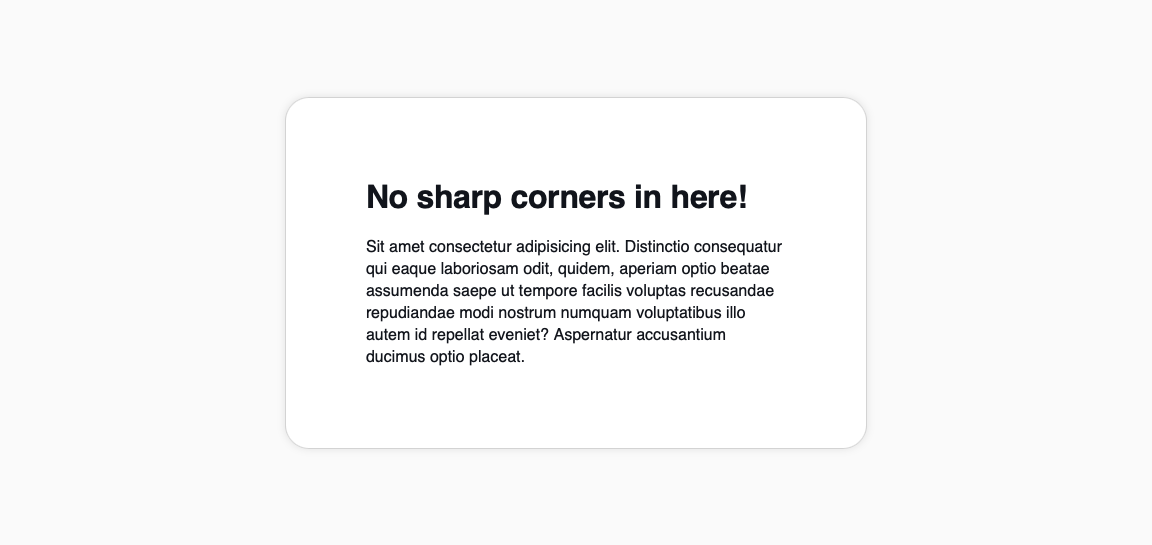
This is your usual card with rounded corners. Nothing new. You all know how to do this, I assume.
Here’s the markup we’re starting this exercise with:
<div class="card">
  <h1>No sharp corners in here!</h1>
  <p>Sit amet consectetur adipisicing elit. Distinctio consequatur qui eaque laboriosam odit, quidem, aperiam optio beatae assumenda saepe ut tempore facilis voluptas recusandae repudiandae modi nostrum numquam voluptatibus illo autem id repellat eveniet? Aspernatur accusantium ducimus optio placeat.</p>
</div>
And these are the base styles of our card:
.card {
  padding: 5rem;
  border: 1px solid lightgray;
  border-radius: 24px;
  box-shadow: 0 0px 8px rgba(0,0,0,0.1);
  position: relative;
  background-color: white;
  max-width: 420px;
}
Now let’s start adding some trickery!
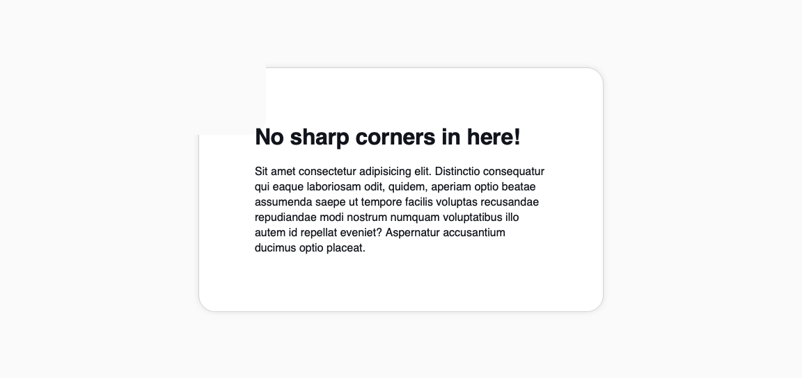
We’ll use the top left corner in this example but this could be done for any corner. One major caveat I didn’t mention earlier is the fact that this will only work on plain colored backgrounds. So if you have a gradient, a photo, an illustration, a pattern or anything that’s not just a color behind your corner, I’m afraid you’re out of luck.
The reason being, the actual cutout is really just a square, as a pseudo-element, positioned at the top left corner and painted the same color as the background.
Let’s add the corner element inside the .card element:
<div class="card__corner"></div>
Which has these styles:
.card__corner {
  position: absolute;
  width: 128px;
  height: 128px;
  top: -32px;
  left: -32px;
  border-radius: 24px;
  display: flex;
  align-items: flex-end;
  justify-content: flex-end;
  overflow: hidden;

  // The actual cutout
  &::before {
    content: '';
    position: absolute;
    width: 100%;
    height: 100%;
    background-color: #FAFAFA;
    top: 0;
    left: 0;
  }
}
As you can see, it’s really just a square, as mentioned above.
Next, we’re going to be adding two pseudo-elements to round the top right corner as well as the bottom left corner. Leaving just the inner corner to be solved.
Let’s do the top right corner first.
<div class="card__corner">
  <div class="card__corner-tr"></div>
</div>
// Top right corner
.card__corner-tr {
  position: absolute;
  top: 31px;
  right: -24px;
  width: 48px;
  height: 100%;
  background-color: white;
  border: 1px solid lightgray;
  border-radius: 24px 0 0 0;
  box-shadow: 0 0px 8px rgba(0,0,0,0.1);
}
Now let’s add the bottom left corner too:
<div class="card__corner">
  <div class="card__corner-tr"></div>
  <div class="card__corner-bl"></div>
</div>
// Bottom left corner
.card__corner-bl {
  position: absolute;
  bottom: -24px;
  left: 31px;
  width: 100%;
  height: 48px;
  background-color: white;
  border: 1px solid lightgray;
  border-radius: 24px 0 0 0;
  box-shadow: 0 0px 8px rgba(0,0,0,0.1);
}

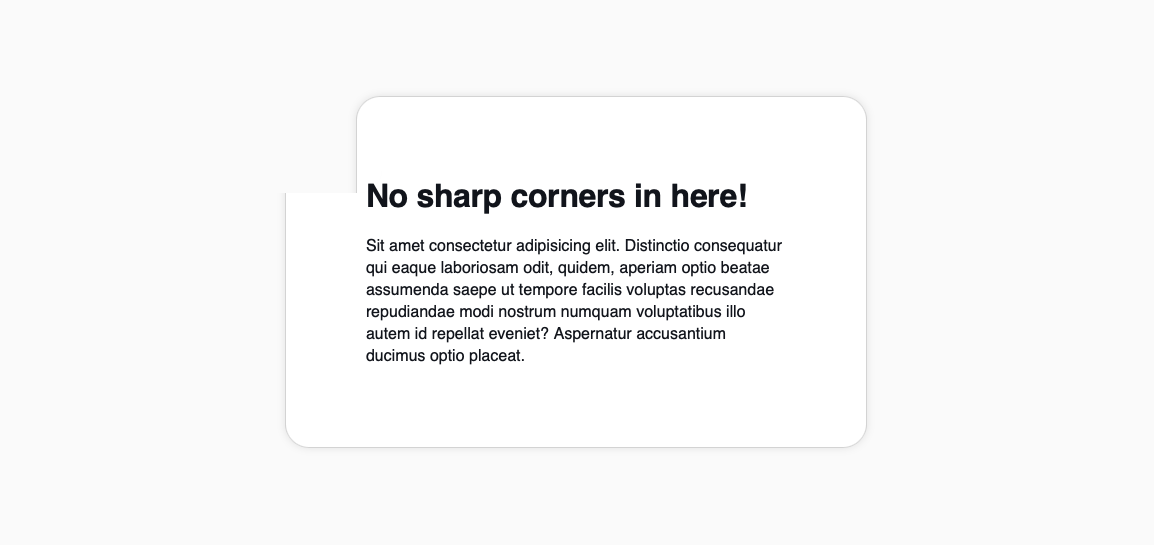
Now that it’s starting to take shape, it has become obvious that the issue here is the intersection of the bottom left and top right corners. Well, these are not actually corners as you can see. These are full length elements with 1 rounded corner. And that’s exactly why the intersection becomes problematic.
But we can fix that with an extra element.
Let’s add the inner corner, or the bottom right corner, if you will.
<div class="card__corner">
  <div class="card__corner-tr"></div>
  <div class="card__corner-bl"></div>
  <div class="card__corner-br"></div>
</div>
// Bottom right corner
.card__corner-br {
  position: absolute;
  width: 48px;
  height: 48px;
  right: 25px;
  bottom: 25px;
  border-radius: 0 0 24px 0;
  box-shadow: 24px 24px 0 24px white, inset -1px -1px 0 0 lightgray;
}
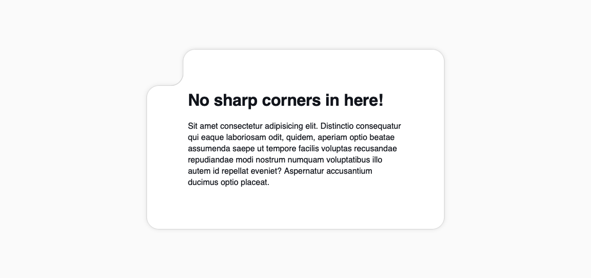
There you go! The usual rounded corner card with a cutout that also has rounded corners.
Bottom line
Although this is possible to do with CSS there are some things to have in mind.
We can use borders, as we’re doing in the example, and even box-shadow, but as mentioned above, we can’t use backgrounds that aren’t just a plain color behind the cutout corner.
Also, consider the fact that, from a design point of view, it may not always work with the content you may have. Even though we’re using a large padding for this card, the cutout corner has very little room between the content and the corner.
Lastly, from an accessibility point of view this should be done avoiding extra markup without any actual content. Remember that screen readers go through the markup looking for content.