Turning Waybar into a safety net
I didn’t want more notifications. I wanted my bar to quietly tell me when something was off. Turns out Waybar already had everything I needed.
At the time of this writing, I’m over 100 days into my Linux journey. This time around, I went with Omarchy, an open-source Arch-based distro put together by DHH.
I did have a few hiccups here and there, especially in the early days. Although I came from macOS—which shares the same default shell—the OS itself is a completely different environment. Things you take for granted on macOS suddenly become choices you have to make yourself. Sometimes that’s empowering. Sometimes it bites you.
What I missed from macOS
One thing I always liked about macOS was my system monitor setup. I used Stats, and it was perfect for how I work.
I didn’t need dashboards, graphs, or windows popping up. I just needed to glance at the top-right corner and instantly know how things were doing: CPU, RAM, temperature, network usage, disk space. No context switching. No effort.
That quick feedback loop is something you don’t realize you rely on until it’s gone.
Waybar is great… until it isn’t
Omarchy comes with Waybar modules for all of this out of the box. CPU, memory, disk, temperature—it’s all there.
But there’s a catch: nothing warns you when things go wrong.
If your main drive slowly creeps past 80% usage, Waybar will happily keep showing the same icon like nothing’s happening. Ask me how I know.
That’s the kind of thing that doesn’t hurt immediately, but can quietly snowball into broken updates, weird crashes, or a system that suddenly refuses to cooperate.
Adding visual warnings
To prevent future surprises, I added thresholds to my Waybar modules. The idea was simple:
let me focus on my work, and have the bar yell at me only when it really needs my attention.
This is a two-part setup:
- Define thresholds in Waybar
- Style them with CSS
Let’s start with the thresholds.
Defining thresholds in Waybar
Here’s the relevant part of my Waybar config:
{
  "disk": {
    "states": {
      "warning": 65,
      "critical": 80
    }
  },
  "memory": {
    "states": {
      "warning": 70,
      "critical": 85
    }
  },
  "temperature": {
    "warning-threshold": 70,
    "critical-threshold": 90
  },
  "cpu": {
    "states": {
      "warning": 70,
      "critical": 85
    }
  }
}
These numbers are highly subjective. A warning at 65% disk usage might feel aggressive to some people.
For me, it makes sense. My disk usually sits around 30% usage, so a jump to 65% means something is going on—often logs growing out of control or a process misbehaving. I’d rather know early than too late.
Just keep in mind:
- Disk, memory, and CPU are percentages
- Temperature is in degrees
How Waybar uses these states
Once a threshold is crossed, Waybar automatically adds either a .warning or .critical class to the module.
At that point, Waybar has done its job. Now it’s up to CSS to decide what those states actually look like.
Styling warnings with CSS
This part is refreshingly simple.
*.warning {
  color: #fabd2f;
}

*.critical {
  color: #fb4934;
}
That’s it.
Any module that enters a warning state turns yellow, and any critical state turns red. I’m using Gruvbox across my whole setup, so these colors fit right in without feeling out of place.
Seeing it in action
Normal disk usage looks calm and boring—exactly how it should be.
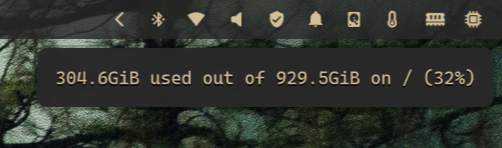
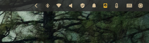
Once disk usage crosses the warning threshold, the color shifts.
And when it goes critical, there’s no ambiguity anymore.
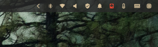
No notifications. No popups. Just a quiet but very clear signal.
Bonus: custom modules
This setup isn’t limited to built-in modules—and this is where it really starts paying off.
I use Mullvad VPN on a daily basis. In my Waybar, it shows up as a small shield icon next to the bell. I don’t need throughput numbers or connection graphs. I just need to know one thing: am I protected or not? And when I want more detail, I can just hover the icon and get city, country and IP address it’s connected to.
Here’s the custom module definition in my Waybar config:
"custom/mullvad": {
  "exec": "/home/pmpinto/dotfiles/scripts/mullvad-waybar",
  "interval": 5,
  "format": "{text}",
  "return-type": "json",
  "tooltip": "{tooltip}",
  "on-click": "mullvad-vpn"
}
Waybar runs a script every few seconds, expects JSON back, and simply renders whatever it’s given. The important bit here is that custom modules can emit classes, just like built-in ones.
Here’s the script behind it:
#!/usr/bin/env bash
STATUS="$(mullvad status)"
if echo "$STATUS" | grep -q "^Connected"; then
RELAY_LINE="$(echo "$STATUS" | grep 'Visible location')"
LOCATION="$(echo "$RELAY_LINE" | sed -E 's/.*Visible location:\s*([^\.]+).*/\1/')"
IP="$(echo "$RELAY_LINE" | sed -E 's/.*IPv4:\s*([0-9\.]+).*/\1/')"
echo "{\"text\":\"\",\"tooltip\":\"Connected to $LOCATION ($IP)\"}"
else
echo "{\"text\":\"\",\"tooltip\":\"VPN Disconnected\",\"class\":\"critical\"}"
fi
When Mullvad is connected, the module shows a calm shield icon with a tooltip telling me the location and IP. Nothing fancy, nothing noisy.
But when it disconnects, the script adds a critical class to the output. From there, Waybar does its thing and CSS kicks in automatically—turning the icon red.
No notifications. No alerts. Just one glance at the bar and I immediately know something’s wrong.
Reloading Waybar in Omarchy
One last tip: if you ever need to reload Waybar in Omarchy, it’s bound to SUPER + SHIFT + SPACE.
You’ll use it more than you think. Super handy.
Takeaways
Visual signals work better than alerts when you want to stay focused. A small color change is enough to register that something needs attention without pulling you out of what you are doing.
Waybar already knows the state of your system. Once you start using that information instead of ignoring it, the bar stops being decorative and starts being genuinely useful.
Custom modules can benefit from this approach too. When your own scripts can emit warning or critical states, the status bar becomes a reliable source of truth instead of just a row of decorative icons.