Why I’m using uniform spacings across my website
White space is vital for website design. Too much makes it look broken, while too little feels cramped. Uniform spacing keeps your design balanced.
This may sound more complicated than it really is, at least from a developer’s point of view. While you should also rely on uniform spacings while designing your website, it should clearly be communicated upfront to the developers since it will make their life that much easier.
Designing
I personally use Sketch. You may say I’m biased because I worked at Sketch and helped shape the website and its codebase as it is today. But the truth is that I have been using Sketch for more than 10 years now. Long before I had joined the team in the first place.
If you’re using Sketch, like me, the first thing you should do is go to Settings > Canvas and then look for the “Nudging” section at the bottom.
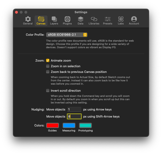
Here you can define by how many pixels you want your objects to be nudged when using the keyboard shortcuts. I use 8px. This is key.
Why 8px
Well, the first reason is just the fact that you want to avoid “magic numbers”. These are values that you pick for no reason whatsoever.
For instance, when you need to vertically space a heading from a paragraph you will need to define a space between the two. The number you pick could be anything. Why go with 13px? Or 5px? Maybe 27px looks better to you?
That’s all fair, and we all know how design can be a very subjective topic. What looks best to me may not look to you, and that’s fine.
A great way to avoid “magic numbers” is coming up with a numerical scale. The easiest approach is picking a number that’s easily divisible and can be multiplied by any integer.
Enter, the number 8!
Your scale could look something like this:
2, 4, 8, 16, 24, 32, 40, 48, 56, 64, 72, 80, 88…
For very small elements you may need a spacing of 4px or even 2px, that’s fine. Most of the time, though, you will use any number that’s a result of 8 × [integer of choice]. No matter what you pick as your integer of choice, the result will always be a multiple of 8, making your design look more cohesive.
Developing
While on the design front you need to nudge objects by hand and there’s room for mistakes, the good thing is that those can be easily fixed when developing.
I personally use a SCSS function I call units(). SCSS functions are small bits of logic that accept a value and output something else. Ideal for what we need here.
$unit-base-rem: 0.5rem; // Usually 8px

@function units($multiplier: 1) {
  @return calc($unit-base-rem * $multiplier);
}
As you can see, the function accepts a $multiplier value, which is set to 1 by default. And simply returns the result of calc()—which is another SCSS function—as a rem value, for extra flexibility.
This calc() function is very similar to the native CSS function. Here’s how it differs, according to the documentation:
It’s the same syntax as the CSS
calc(), but with the additional ability to use Sass variables and call Sass functions.
That small difference is key for what we need here, since we’re providing it with a $unit-base-rem value of our own.
Here’s how you can use it:
.element {
  margin: units(2); // 16px but returns 1rem
  padding: units(3); // 24px but returns 1.5rem
}
This units() function can be used pretty much anywhere CSS accepts a length value, for instance: padding, margin, border-radius, gap, calc(), height, width, top, right, translate, etc.
You may be wondering how you can the get 4px out of it. After all that was one of the possible values from your numerical scale from above.
That’s easy, you just provide 0.5 as the multiplier, like so: units(0.5)
Bottom line
By using a units() function like this, you not only ensure your website is spaced harmoniously from top to bottom—and left to right, really—but also makes possible for the user to increase the zoom level on their device and your website scales accordingly.
Something that wouldn’t happen if you just used 8px instead of the 0.5rem as the value for $unit-base-rem.
Besides all that, you avoid magic numbers and it makes your life easier down the road.
Oh, and yes, if you’re wondering you do get accustomed to multiplying 8 by any integer in your head. You will reach for a calculator less and less as time goes on.